Share with:
By Delphine Riffaud
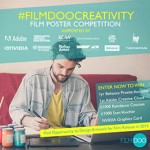
In May this year, during Cannes, FilmDoo announced the winners of the FilmDoo Poster Competition – supported by global tech leading brands (Adobe, Scan, Nvidia), UK distributors (Third Window, Terracotta, Picturehouse, Peccadillo, Altitude) and other members of the film sector (Little White Lies, Shooting People, The Raygun). The top three designs were awarded fantastic prizes including the opportunity to work with a UK distributor on an upcoming film release. Marie Bergeron from Montreal, Canada, came first with her artwork for the The Godfather (1972) and was chosen by Third Window Films to work on the special edition of Takeshi Kitano’s 1997 Venice Film Festival winner Hana-bi (Fireworks) – to be released in January.
The release, supported by Welsh director Gareth Evans (The Raid, The Raid 2), is highly anticipated by UK fans of Kitano’s work (including for the FilmDoo team!). FilmDoo interviewed Marie to know more about the process she used to develop the artwork and her reactions.
THE APPROACH
FilmDoo: Have you already done projects for film distributors/companies? If so, what was different this time?
Marie: I did conclude some projects with the big industry guys – Paramount, Warner Brothers, Marvel etc. But it was mostly to buy our already made design and use it for a third party marketing or just to have those posters close by. But nothing “official” like I did with Third Window Films. Really stoked!
Had you seen Hana-bi before working on it?
No! And I should have! But of course before working on the cover itself I had to watch it… I’m glad I did. Great film. I did know Kitano though as I watched a few of his films.
Did you feel more pressure working on a cult film and director with a strong fan base?
Indeed, I did. Working on a big title such as Avengers per se, means that the fan base is huge and more mainstream… Having a fan base based on these big budget films means that there will always be people loving your stuff because the audience is large. But a film from Kitano has a very niche fan base that is usually more picky. I don’t mean it as a bad thing, on the contrary! It means that they care a lot about it, and I should do the same.
What was your first inspiration and approach around the project?
Hana-bi is definitely the most challenging concept I have done in years. First, the movie has a very subtle but fascinating atmosphere. Despite its violence, the story brings you back to a more basic and human emotion – love. It comes down to two antagonists meeting each other, which is hard to conceptualize, at least for this movie.
THE PROCESS
Third Window Films shared your first sketches on Facebook to ask for audience feedback. Did the comments impact the next step of your work?
They definitely did. I read all of the comments and did appreciate it. They did not hate on it (like most of the Internet seems to be about) and they actually criticized it in a constructive way. As a designer, that’s all I ask for. “You don’t like it? Well, tell me why.” I think it’s essential and a very good way to evolve in your career. Their comments helped me to decide on the last piece.
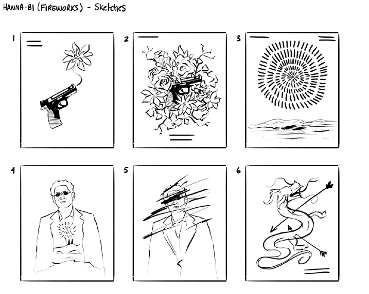
What element of the poster did you struggle the most with (if any)?
Kitano’s face. I always struggle with faces…. I wasn’t sure about the style I should give him. I didn’t want to put too many details, as I don’t think it’s the best way to go for a cover. It needs to be punchy. I could have gone many different directions, but I stuck to a two colour-base artwork with strong shapes.
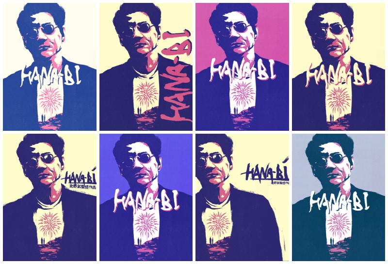
Then, the fans discovered two versions with opposite palettes of colours: red and blue. What made you decide on those two artworks?
Regarding the colours, I know that red is best to catch the eye. Actually, red and yellow are the catchiest colours to our brain. (You will never miss a McDonald’s sign, even if you never eat there). So my first option was based on red and yellow. But Third Window Films suggested a blue version; closer to the original cover and thought it was the way to go.
The final Facebook vote revealed different nuances around blue, purple, beige. How do you work around colour variations?
I’m a huge beige fan. In every concept I show, I have at least one beige/light yellow version. It gives that vintage look somehow. For blue and purple it was based on the original cover. I picked those colours and played around with them.
THE OUTCOME
Were you surprised by the outcome of the process?
Not so much, as I almost use the same process for all my works. But I worked closer with audience than I ever had before, that’s for sure.
What are you working on at the moment?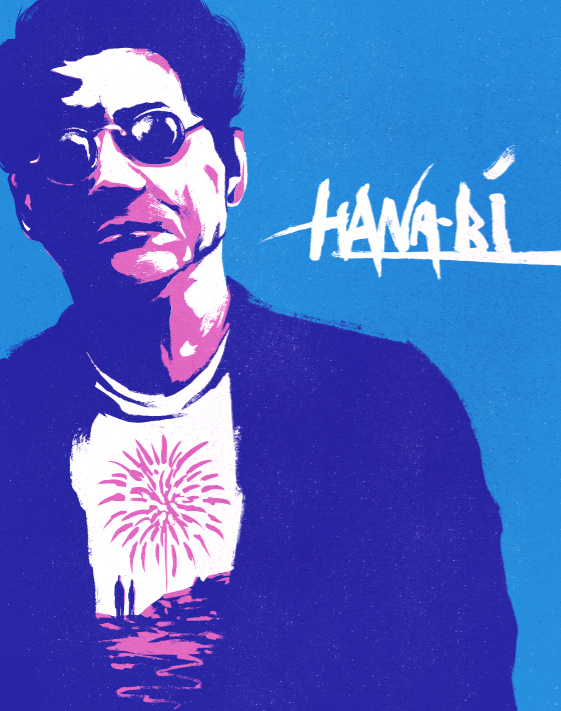
I just finished two pieces for two upcoming exhibitions: one about Back to the Future and the other, well…I’m not allowed to talk about it yet. I also have two posters to create: for a live show of a talented young man and for a short film. I have a great request from someone who does laser printing on wood. He gave me a real challenge that I can’t wait to start working on. I’m also working on an official poster for the anniversary of a great game and since I’m a huge gamer myself, I’m super stoked about it.
Anything else you would like to add?
Just a huge thank to FilmDoo. It then gave me the opportunity to work on a great film with awesome people at Third Window Films that I have to thank again.
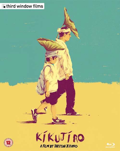
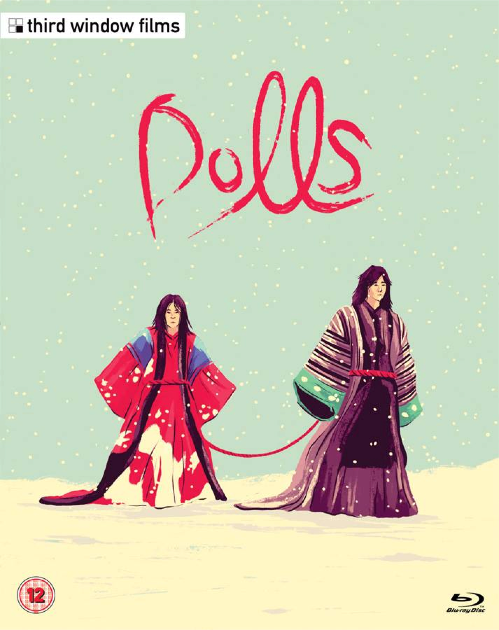
FilmDoo is happy to report that this fruitful collaboration is set to continue – Third Window has asked Marie to design the artwork for all Kitano releases! Here you can see Marie’s artwork for Kikujiro (1999) and Dolls (2002).
Watch more Third Window Films at FilmDoo.com. (UK & Ireland only)